Francisco Kjolseth // The Salt Lake Tribune
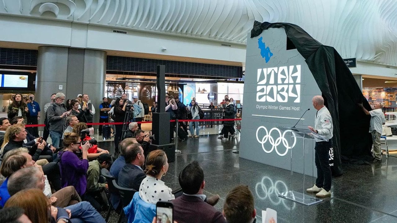
On a Monday, Gov. Spencer Cox stood in front of a crowd at the Salt Lake International Airport as Olympic officials unveiled both the official name and the transitional logo for the 2034 Winter Games. By Tuesday morning, the governor was standing in front of a room full of reporters and joking that the Utah 2034 logo had already fulfilled its purpose.
“It’s really brought people together,” he said, “because everyone seems to not like it.”
The logo has been controversial at best, widely panned at worst. It’s designed with a blocky font that mimics shapes found in Utah’s landscape — the most obvious of which is the “A” that replicates the contour of Delicate Arch. Commenters on social media sites and news articles have quipped it’s the same font used in CAPTCHAs or their fourth-grade book reports. Others complain it’s ugly or simply difficult to read.
To which its designers say: Try looking at it through a different pair of eyes.
The creators of the Utah 2034 transitional logo conferred with athletes with vision disabilities to, they say, make it as impactful as possible for as many people as possible in as many places as possible. They’ve created a piece that they say reflects the local Olympic and Paralympic committee’s whole-state approach to the 2034 Winter Games. And, they’ve done it all while working within the strict parameters set by the International Olympic Committee for transitional logos — which, in and of themselves, are fairly new.
Plus, noted Nate Morley, the lead designer, it’s art. It’s meant to be provocative.
“Art is subjective. And some people like things, and some people don’t like things. And that’s totally to be expected, and we certainly appreciate that,” Morley, a Utahn whose company, Works Collective, also designed the LA28 Olympic logo, told The Salt Lake Tribune. “I think the intent is to learn kind of why the logo looks the way it looks — what it’s meant to represent — and build that.”
The shape inside the zero, for instance, is evocative of a pictograph, according to a website local Olympic organizers launched to explain the controversial wordmark. The curves of the number two mimic those of a winding mountain road. When stacked, its letters and numbers form a checkerboard pattern reminiscent of Utah’s street grids.
Yet the design goes even deeper than that, said Danelle Umstead, an athlete with low vision.
“Every Olympic logo gets backlash,” Umstead, a four-time Paralympian, said in a text. “People forget that logos aren’t created to be trendy — they’re designed to be recognizable for decades, across stadiums, uniforms, merchandise, tiny smartphone screens, and global broadcasts.
“A lot of the early criticism focused on aesthetics alone, without understanding that accessibility was part of the design story.”
And that is a process into whi